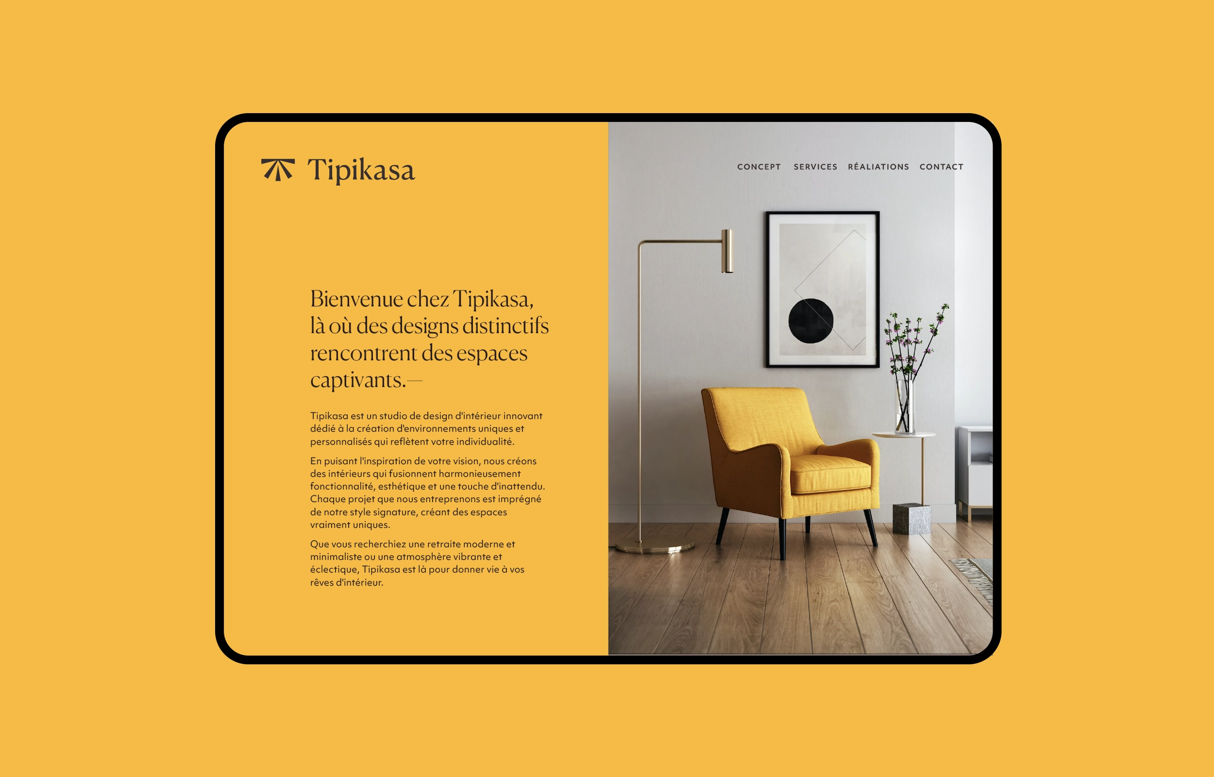
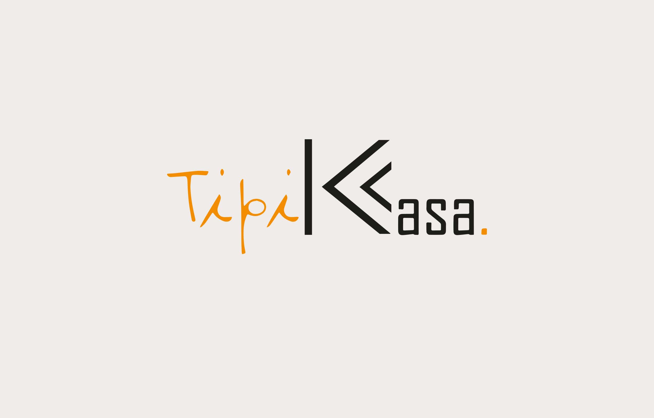
Tipikasa, giving the 'K' a twist
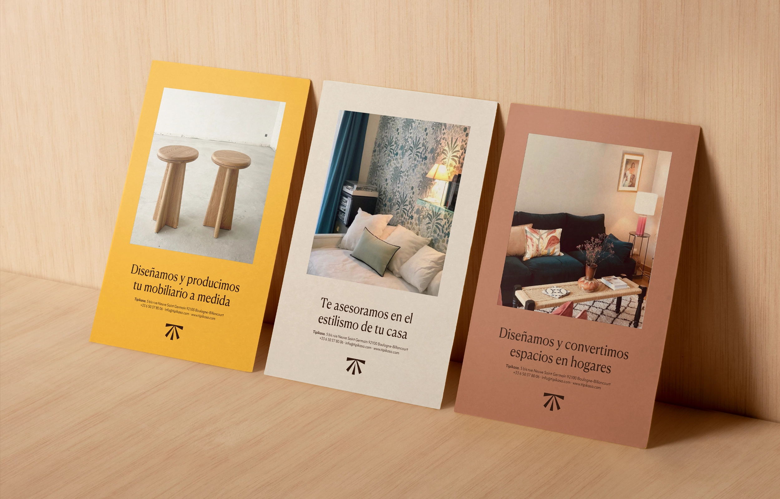
Tipikasa is an interior design studio with over a decade of experience creating unique, human-centered spaces with an ethnic touch. Based in Paris and the Basque Country, it is known for transforming houses into homes.
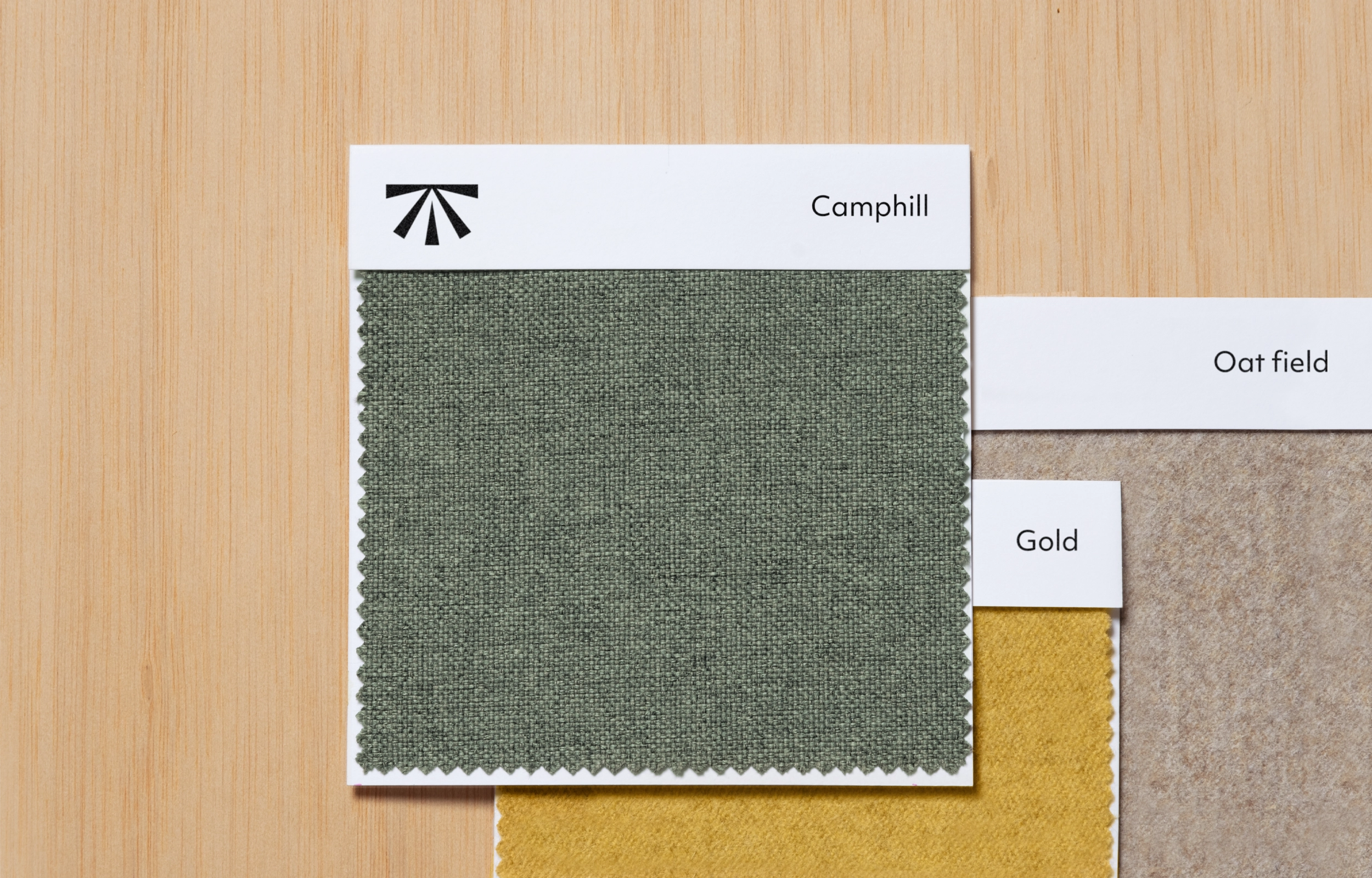
Its creative director and founder approached us with the task of refreshing the brand, as she felt it had started to show its age. She provided us with a hint that guided the project; she wanted us to 'give a twist to the K', the symbol that has represented them for over ten years. We literally turned the 'K' upside down, creating an abstract symbol with ethnic nuances, and with its terminals, paying homage to traditional Basque typography.
From here, we developed a graphic language that makes Tipikasa a recognizable, approachable, and timeless brand in all its touchpoints.
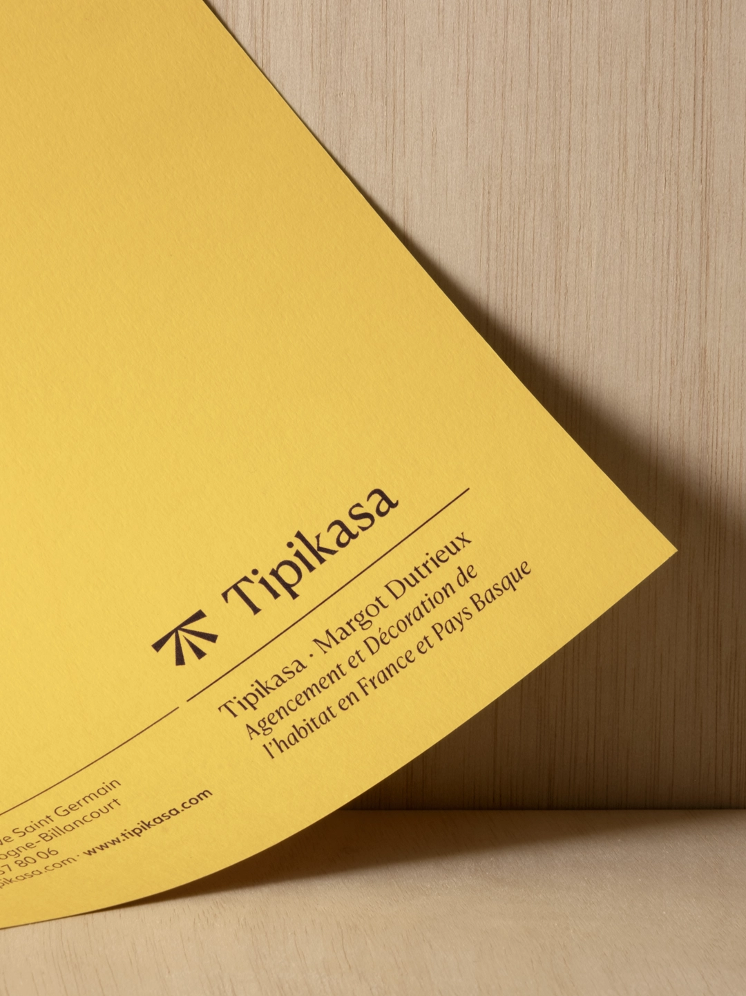
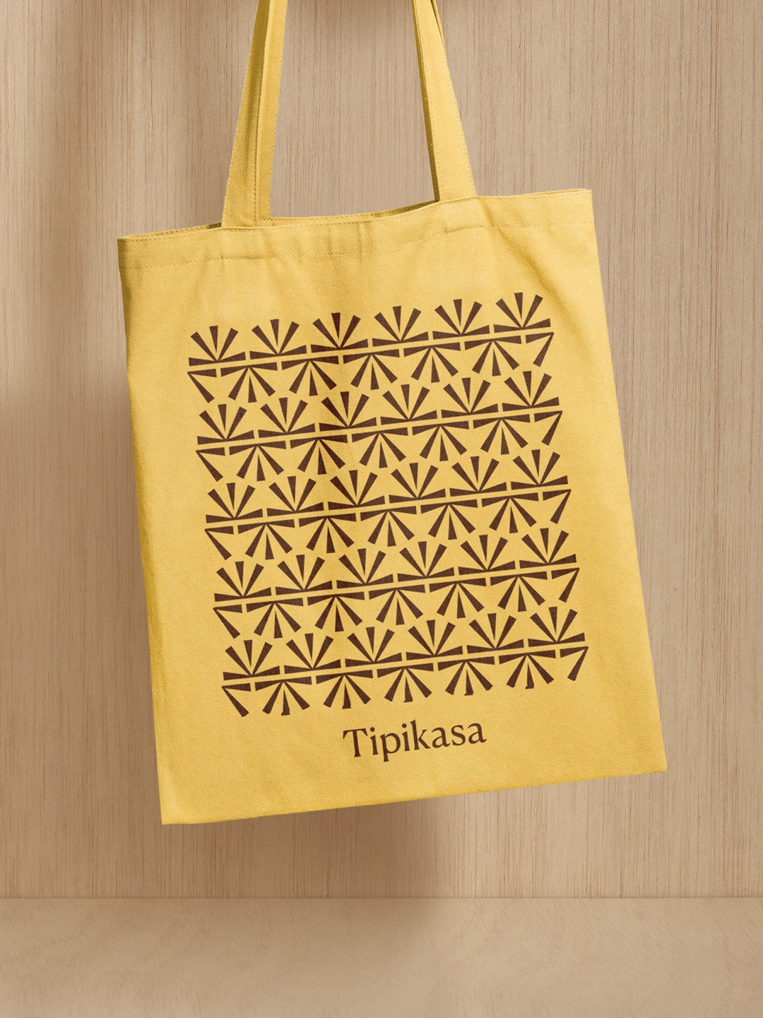
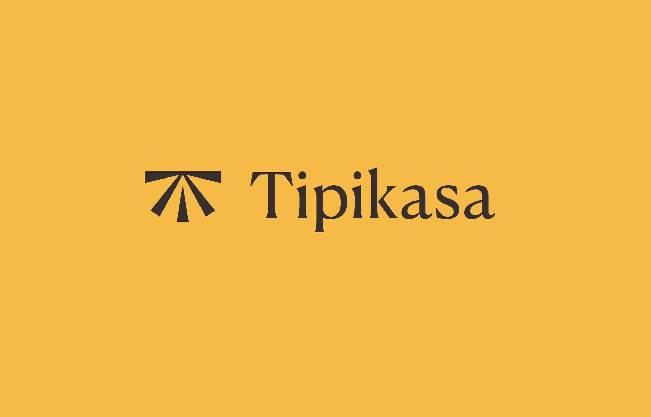
The details of the logomark nod to traditional Basque typography